No one likes writing grant applications. I’m not even sure anyone enjoys reading them. Yet many of us have to endure this painful process to continue the work we love. Sometimes, because these forms can seem so cut and dry, we easily forget that a simple anecdote or visual can be incredibly helpful. So here are some ideas to help your application stand out from the rest.
Animate
Graphs or infographics are a good start. Colorful charts with data that may be impactful. But have you considered animated charts?
Infogram and Visme are both inexpensive online chart makers, while LiveGap is free. They’re all easy to use and give a little extra zing to a presentation.
If that’s all too much, and you’re just looking for beautiful charts, try Canva to make a bold graphic. Also, it’s free (mostly).
Location, location, location
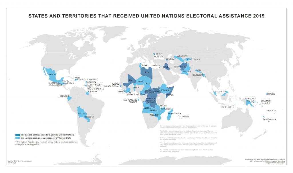
Where is your project supposed to happen? Try to include a map that details your intended impact zone.
Here are a few tips:
- No more than half a page
- Use one or two colors (three at a push) to give extra details
- Keep it simple
Adding the ‘where’ can help a reader understand the ‘why’.
Bonus tip: Relevant state or federal agencies may have maps online that highlight useful information. A little research can pay big dividends. And don’t forget to attribute the source of any information.
Stories are more memorable than data
Who does your project affect? It’s ok if you aren’t a professional photographer, but a human story with a photo will elevate any proposal. Think about who will be affected by the funding (or lack thereof). Consider a photo of a family or their home. Obviously, the usual rules about sensitivity and privacy apply. You could even embed a short video of them telling their own story – letting your subjects speak for themselves is powerful and will stick with the grant committee.
Choose your colors wisely
One thing many people forget is accessibility. Not everyone has 20/20 vision. Some conditions, such as dyslexia, can make reading high-contrast colors uncomfortable. Narrow fonts should also be avoided. This Knight Lab toolkit is a helpful resource on how to keep color-blind readers in mind when building charts.
And finally, don’t over-do it
Here are a few easy tips to keep it simple and classy:
- One or two images or graphics on any given page is enough.
- Try offsetting your visual elements to break up your text.
- Keep visual consistency throughout your proposal – check and double-check the font sizes of your headings and subheadings.
- Make sure your bullet points are aligned correctly.
- If you need to convert your presentation to a static PDF, make sure the quality of the images hasn’t degraded during the export process.
Finally, highlighting key text in bold adds to visual appeal and comprehension. Longer or more important messages can be put inside a text box. However, use judiciously.
How have you made your grant applications stand out? Drop me a tweet @TaraTW, or join the conversation on our Master Visual Storytelling Facebook group

")
