Have you watched ‘Pandemic: How To Prevent An Outbreak’ on Netflix yet? If not, go watch it.
One person that really stood out on the docuseries was Jake Glanville. And not just for the amazing efforts he and his team at Distributed Bio are doing to produce the first universal flu vaccination.
He is also an excellent visual storyteller.

He prioritizes storytelling in a technical field because he knows the importance of a larger general audience understanding his work.
Glanville said – “I think about the arc of the story I’m going to tell, and really good storytelling, those rules apply to science.”
This drives home a point I’m often making – visual storytelling is a vital skill for every field.
Though lately, I’ve been struggling with storytelling in the time of the coronavirus. I keep thinking what’s appropriate? What’s too much? What do we need? How can I help?
We find ourselves in uncharted territory, and everyone, including myself, is outside their comfort zone.
But, Glanville snapped me out of my pandemic haze.
We need visual storytelling right now more than ever. We need to bridge our emotions with logic so we can all be part of the solution. How do we do that? With effective, concise and authentic storytelling.
I wanted to share some examples of impressive scientific visuals that I’ve come across recently.
I’m sure you are taking advantage of the many newspaper outlets offering free access to COVID-19 coverage. The Washington Post recently put out a striking, yet simple graphic on how an outbreak can spread exponentially. The graphs on social distancing are a comforting reminder of why we are all staying inside.
Can You Help Create A Cure For COVID? Perhaps!
This free game calls on citizen scientists to solve science puzzles that might help fight COVID-19. You design, build and help identify proteins that may help to bind and neutralize the virus. The idea is to aid scientists in finding effective antiviral treatments.
As terrible luck would have it, COVID-19, coincided around the time of Chinese Lunar New Year – one of the largest travel events on the planet. The New York Times does a brilliant job of explaining how this virus eventually brought us all to a screeching halt. We all know that The New York Times does great Scrollytelling – and they do not disappoint with this one.
The “Social Distancing” Effect
(Image credit: Satellite image ©2020 Maxar Technologies)
The article states social distancing is turning some of the most densely populated places in the world into “ghost towns”. Perhaps, but these satellite images reassure us that most people are heeding the warnings and staying at home.
How Are You Coping With Covid-19?
There are many awesome webinars going on now. And when I can, I jump on a few.
One that I’ve joined recently was one on social media for nonprofits during the COVID-19 crisis, with the Nonprofit Nerds. It introduced me to Mentimeter, an interactive presentation software. You receive real-time information remotely using word clouds, polls, quizzes, and Q&As.
Positive (But Unintended) Consequences

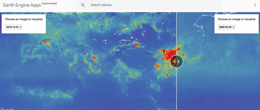
If there is one silver lining in all of this, it might be that global pollution is drastically down. Google Earth shows you just how much of a breather Earth is taking at the moment.


